
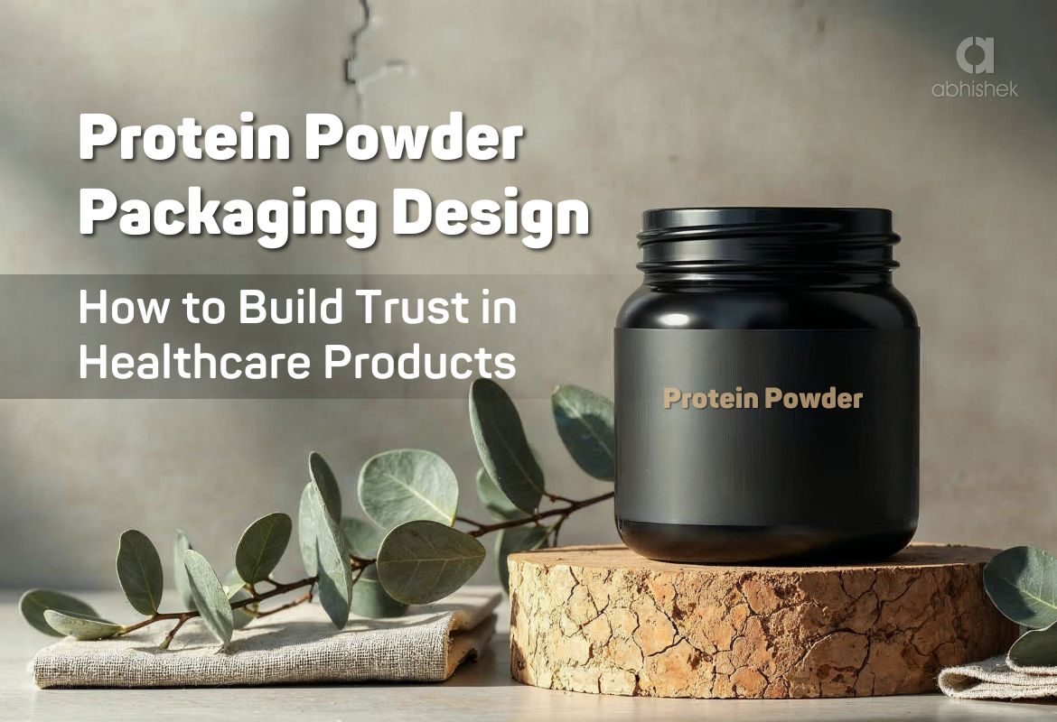
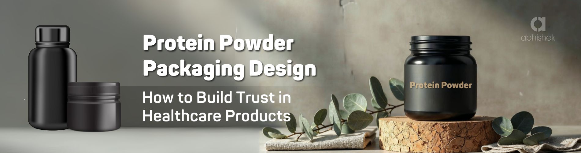
Protein Powder Packaging Design: How to Build Trust in Healthcare Products
Why Packaging Matters in Healthcare
In the healthcare and nutraceutical sector, packaging is far more than an outer cover it is a symbol of safety, trust, and credibility. For protein powders, especially those recommended by doctors or purchased by patients directly, packaging design plays a critical role in brand acceptance.
A well-designed pack not only ensures compliance and clarity but also builds confidence for both healthcare professionals and consumers.

The Rising Demand for Protein Supplements in Healthcare
With the rise of nutraceuticals and functional foods, protein powders are no longer
limited to athletes or fitness enthusiasts. They are now widely used for:
Recovery after surgeries
Cancer and long-term medical care support
General wellness for patients and elderly care
This growing demand has made protein powder packaging design a key differentiator
for healthcare brands.
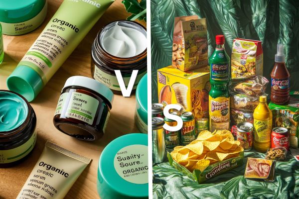
Healthcare vs FMCG Packaging: The Critical Difference
Unlike FMCG packaging, which focuses on attraction and impulse buying,
healthcare packaging must balance two worlds:
Pharma Trust: Accuracy, dosage clarity, and clinical seriousness for doctors and pharmacists.
Consumer Appeal: Emotional reassurance, premium feel, and ease of use for patients and caregivers.
This delicate balance defines whether a healthcare brand builds credibility or gets
lost among generic options.
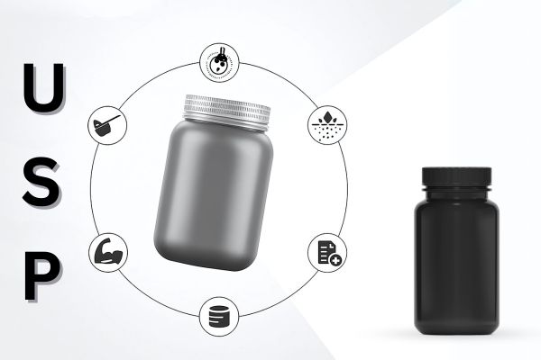
Essential Elements of Protein Powder Packaging Design
- Safety and Compliance: Sealed jars, tamper-proof sachets, and clear expiry/dosage information create trust among medical professionals.
- Clarity in Communication: Minimalist typography and straightforward layouts avoid confusion and help patients understand usage instructions.
- Colour Psychology for Healthcare: Soothing colours like pastel blues, greens, or neutrals bring calmness and reassurance, unlike flashy FMCG tones.
- Premium Yet Minimalist Appeal: Elegance through simplicity positions the product as trustworthy and professional, while still feeling patient-friendly.
How Packaging Influences Doctor Recommendations
Doctors prefer products that visually reflect:
Scientific accuracy | Credibility of the parent pharma company | Consistency across SKUs (sachets, jars, refill packs)
When packaging demonstrates professionalism, doctors are more likely to recommend it, ensuring the product enters the prescription cycle.
Patient & Caregiver Perspective
Patients and families look for:
Approachability: Packaging that feels less intimidating and more caring.
Reassurance: A premium look that signals quality and safety.
Ease of Use: Clear labels, easy-to-open packs, and travel-friendly sachets.
Packaging designed with empathy helps patients accept and trust the product better.
Sustainability in Nutraceutical Packaging
Healthcare brands today are expected to show responsibility not only towards patients but also towards the planet. Using
Eco-friendly jars | Recyclable sachets | Minimal plastic usage
…adds a future-ready layer of trust and aligns the brand with global healthcare values.
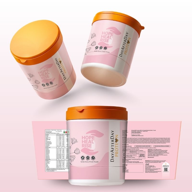
Case Insight Day After Day Protein by Akimoto Pharmaceuticals
A real-world example is Day After Day Protein, a sub-brand of Akimoto Pharmaceuticals.
- Designed for patients recovering from cancer treatments and surgeries.
- Balanced pharma credibility with a premium, patient-friendly identity.
- Used minimalist design, calm colours, and scientific typography to gain acceptance from both doctors and end-users.
This shows how packaging can act as a bridge between science and sensitivity.
Lessons for Healthcare Brands:
- Packaging is a trust-builder, not decoration.
- Design must align with both medical and retail audiences.
- Consistency, clarity, and care are the three pillars of healthcare packaging.
Protein Powder Packaging Design – Day After Day Protein


Final Thoughts
In today’s competitive healthcare market, protein powder packaging design is not just about aesthetics — it is about creating a powerful connection between pharma trust and consumer appeal. Brands that invest in thoughtful packaging gain a clear edge in both prescription and retail markets.
To explore how creative packaging can transform your healthcare or nutraceutical product, visit our Packaging Design Services
🔗
.
Ready to make your healthcare or nutraceutical product stand out?
At Abhishek Graphics, we design packaging that builds pharma trust while connecting with patients and consumers. From jars to sachets,our strategies ensure your product inspires confidence and creates impact.
![]()