
Logos are the most publicly recognizable branding a brand can have, customers can easily identity a brand by its logo and usually associate trust with logos they can identify. Most major brands look to get their logos redesigned from time to time so that their brand’s logo look modern.
Usually a new logo is unveiled when the brand takes on a new approach or direction with its products or services. It’s very hard to get this right and usually there is almost always mixed reactions to this change. And trust me when I say this iconic brands that shell out a lot of money and resources for a logo redesign can still get it wrong. Under Consideration is a great place to keep an eye on some of the best stuff happening around this space.
Old vs new logo
Today we will be taking a look at some of these big brand logo redesigns and see which ones were received positively and which of them were a disaster. Let us know what you think of these via the comments below.
Logo Redesign Before and After
Oxford Dictionaries
Oxford Dictionaries probably offers the most comprehensive coverage of English from around the world and is very likely the foremost authority on current English usage. Their new logo looks like a flipped version of Beats by Dr. Dre in a blueish color.
Fitness First
Fitness First is one of the largest privately owned health club group in the world, consisting of over 500 clubs worldwide with over 1 million members span across 21 countries. They recently unveiled their new brand positioning, strategy, visual identity and tone of voice by partnering with UK based The Clearing. This new looks goes with a much more powerful 1F monogram.
Visa
Visa is one of the biggest players in global digital payments and this logo redesign is telling me that even the big players can get it wrong. I am lost as to what was the real need for this re design.
Academy of Motion Picture Arts and Sciences (AMPAS)
Academy of Motion Picture Arts and Sciences unveiled a new logo for the first time in the company’s history. The new logo spotlights the Oscar in negative space within a triangular shape which forms an A. Creative agency 180LA helped develop the new visual identity for the Academy. Check out their post on the redesign here.
Mail Chimp
Mail Chimp recently redesigned their logo to look more modern without drastically changing it. The design was conceived by graphic designer Jessica Hirsch.
Facebook’s Logo
Facebook did push out a small change to its f logo, when it decided to eliminate the light blue line at the bottom of its previous logo. This small change gave this logo a very flat look which is probably what they were looking for.
Instagram has a wordmark logo and the new redesign has a smoother and more fluid look to it. The logo was designed by Mackey Saturday, you can see more on this design on Dribble
Firefox
Firefox also opted for a minimal change to modernize their logo. The Mozilla designer team was responsible for this redesign; you can find more info on this redesign on Mozilla designer Sean Martell’s blog
Philips
Royal Philips added a bit more color and a few curves to its existing logo for their logo re-brand. I believe this was designed by their in-house design team and you can learn more about this from a blog post on stocklogos.com
eBay
eBay‘s logo redesign kept somewhat the old colors but took out the disorderly letter arrangement and opted for a clean minimal look which was more corporate in nature. Some felt that the connected and diverse nature that was represented with the old logo was lost with the new redesign.
Bing
Bing Microsoft’s attempt at a search engine got a new logo, which most likely was designed by the in house designers at Bing. This new logo moves away from the traditional blue to an warmer orange color. Get more info on this redesigns from the designers at Bing blog
Microsoft
Microsoft‘s logo was getting kinda dated and they pushed out a colorful and clean logo that incorporated the Windows colors, in the form of four square tiles.
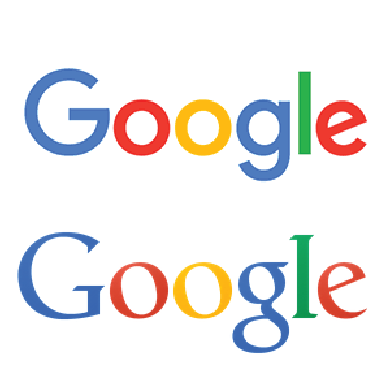
Google took a flat approach to their logo redesign which looks really good across all devices.
Yahoo
Yahoo did something called “30 Days of Change”, during which they revealed a new variation of their logo each day. The final logo was something that the Yahoo design team and Yahoo CEO Marissa Mayer worked on. Read what the CEO had to say on their logo redesign.
When updating your logo in the digital age, some key things to remember is to make sure the logo aligns with your brands vision and it scales well from print to mobile.
Some of the interesting trends in recent logo changes are flat and minimalist design, wider spacing etc. all of which will help you logo transform gracefully between different medium. Also brace for criticism when you launch the new logo, most people don’t like change but change as they say is inevitable.

![]()