
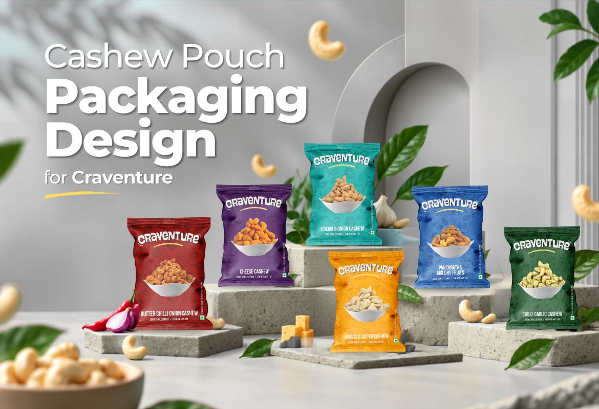
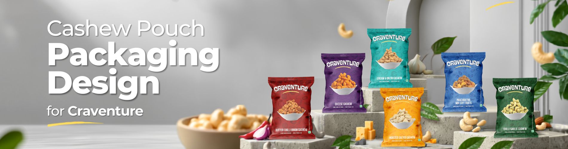
Cashew Pouch Packaging Design for Craventure
One Master Design. Multiple Flavours. One Recognisable Brand.
Craventure’s flavoured cashew range needed more than a series of individually attractive pouches.
It needed a packaging identity that could grow across multiple flavours while keeping the brand instantly recognisable.
Our approach was to create one master packaging design and extend its visual language across the complete cashew range.
The core structure remains consistent. Colours, ingredient illustrations and flavour cues change.
The result is a family of cashew pouches with distinct personalities, connected by one clear Craventure identity.
Project Snapshot
Craventure
Cashew Pouch Packaging Design
FMCG · Food & Snacks · Flavoured Cashews & Dry Fruits
Flexible Pouch Packaging
Master Packaging Design · Multi-Product Packaging System · Pouch Design · Visual Language · Artwork Development
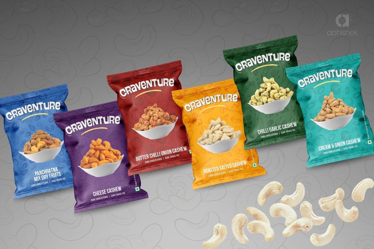
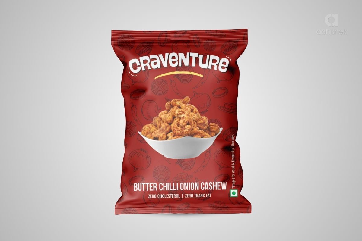
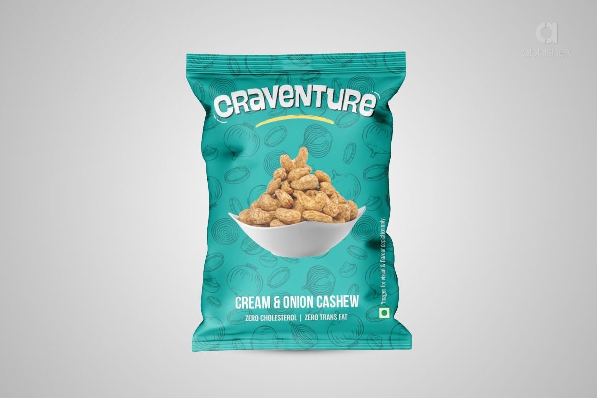
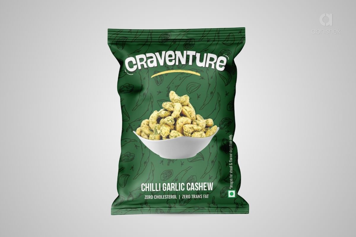
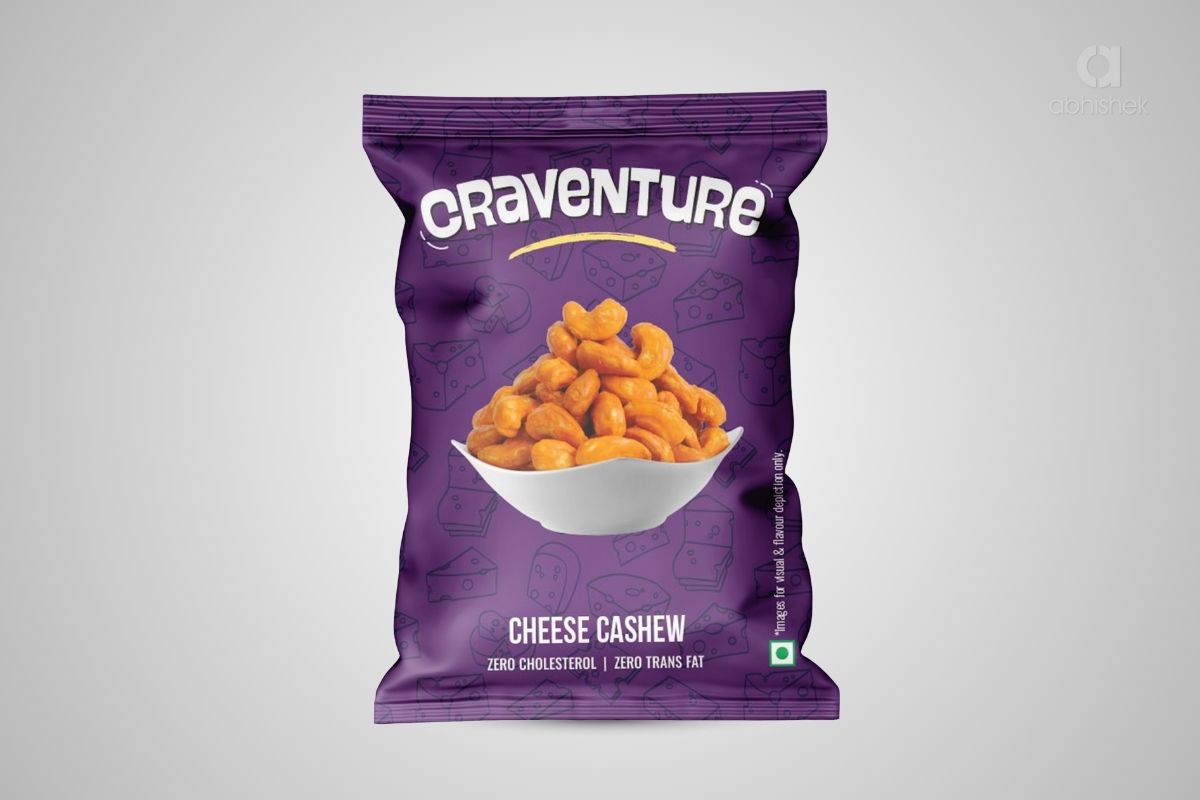
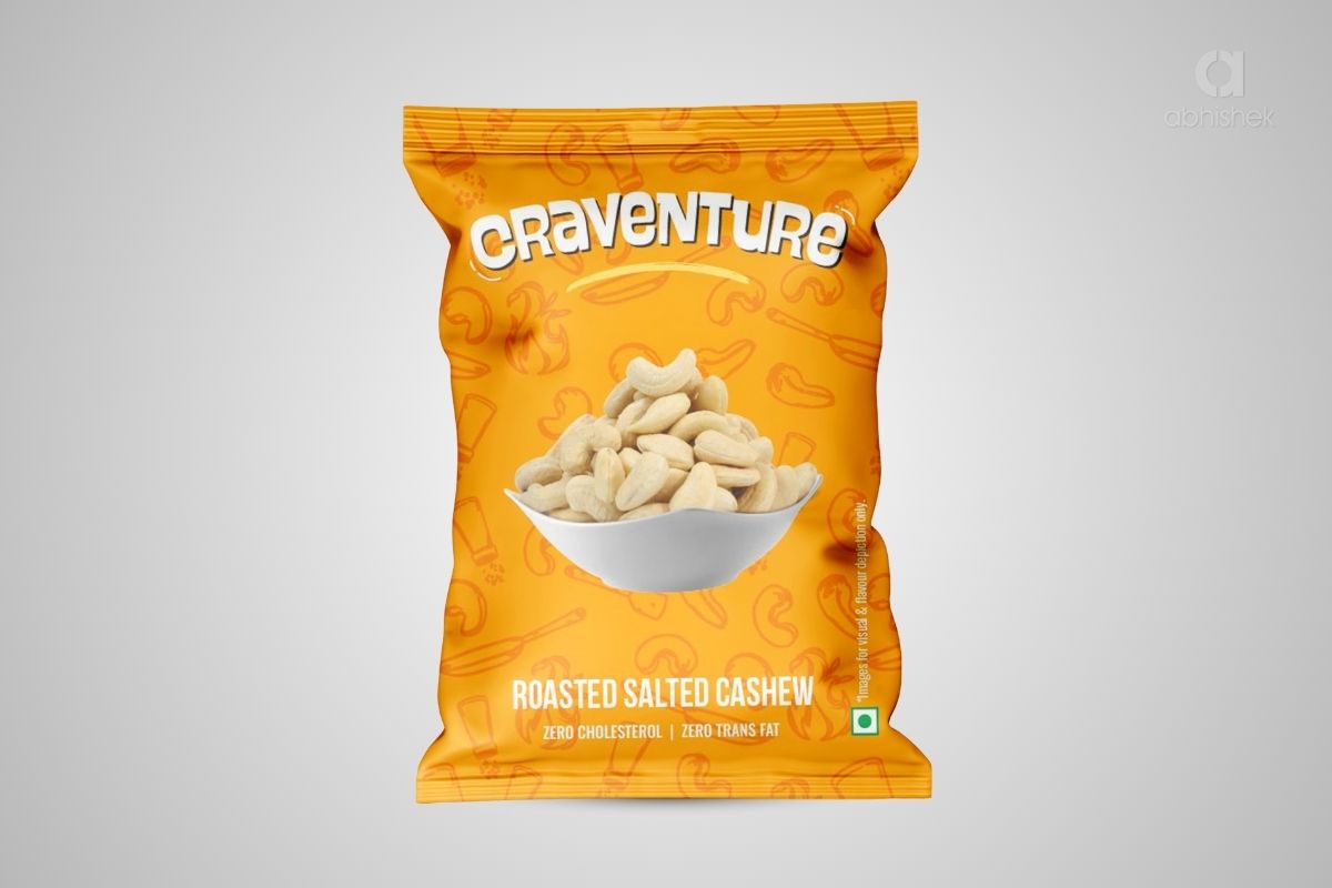
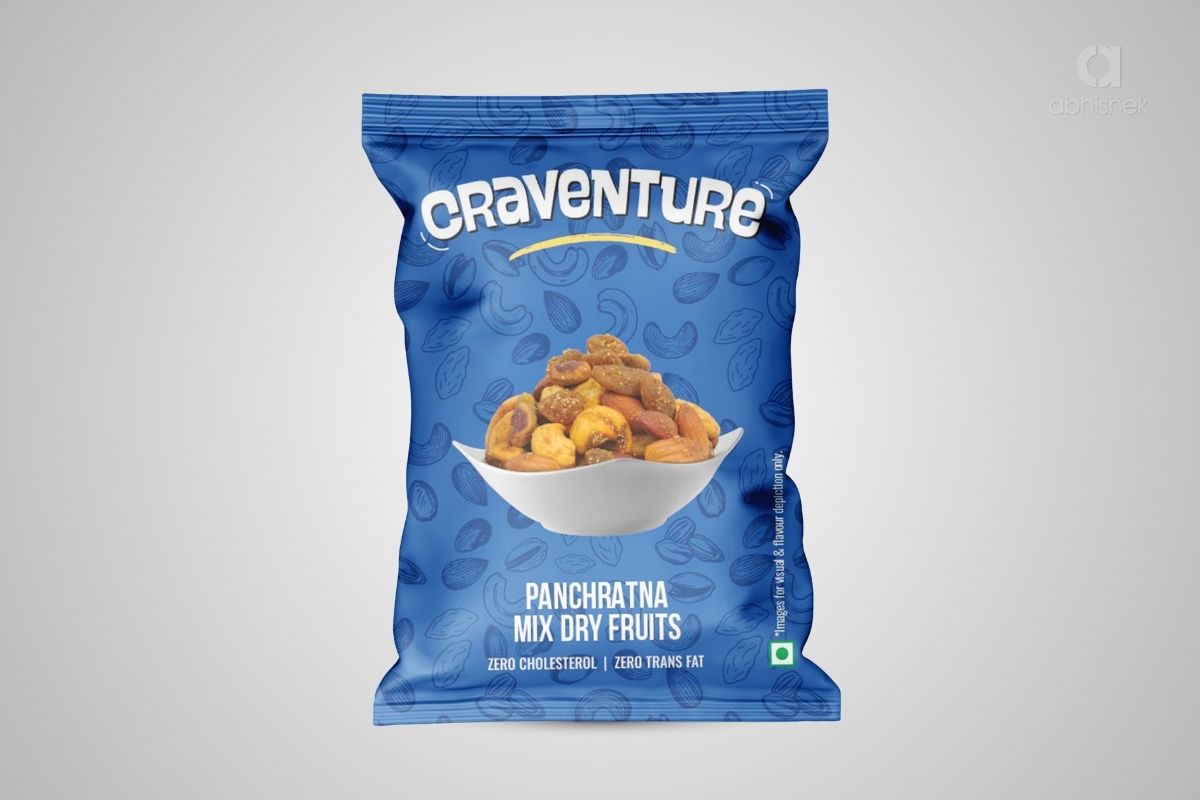
Chilli Garlic Cashew · Cream & Onion Cashew · Cheese Cashew · Butter & Chilly Onion Cashew · Roasted Salted Cashew · Panchratna Mix Dry Fruits
Six Products.
Six Personalities.
One Brand.
Each Craventure product needed its own visual character.
At the same time, all the variants had to look like members of the same product family.
If every pouch looked too similar, product differentiation would become weak. If every product was designed independently, Craventure could lose consistency across the range.
So the challenge was not simply to design six pouches.
It was to determine what should remain consistent and what should change.
That became the foundation of the packaging design.
One Master Pack.
Built to Become
a Family.
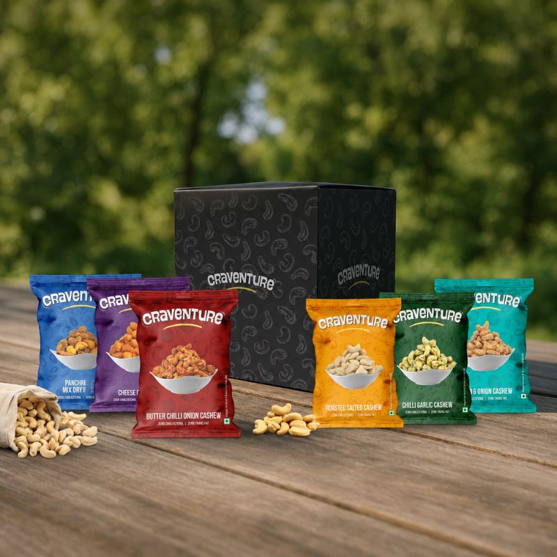
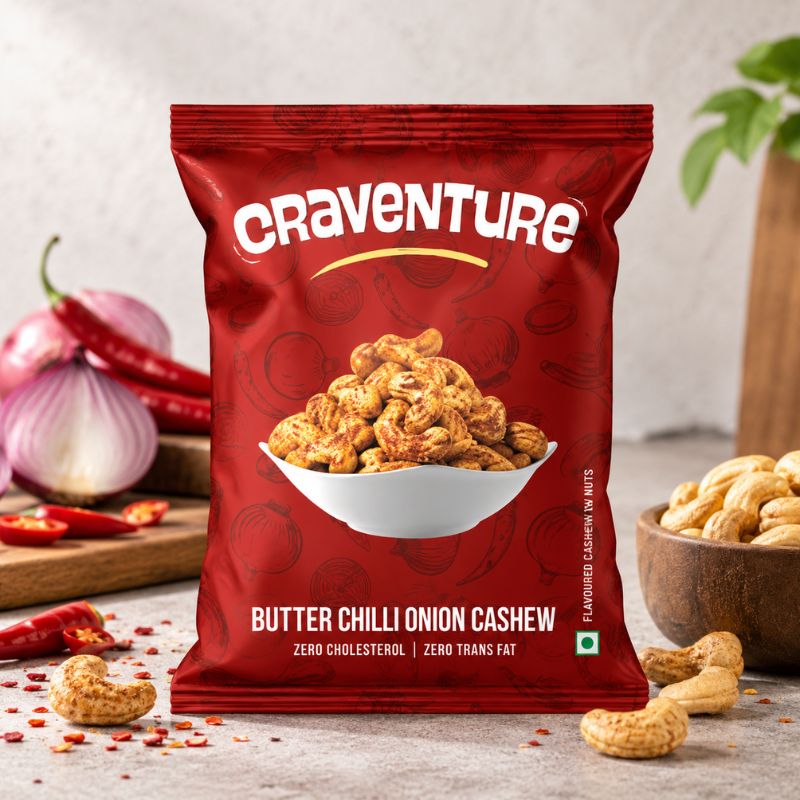
Instead of treating every product as a separate packaging assignment, we developed a master packaging design for Craventure.
The master design established the visual structure of the range: brand prominence, product presentation, typography, product-name placement, information hierarchy and overall pack composition.
Once this foundation was established, individual products could take on their own colour and ingredient-led personality without changing the underlying brand language.
This gave Craventure a packaging system rather than a collection of unrelated pouch designs.
Distinct personalities.
Unmistakably Craventure.
Different at a Glance.
Connected as a Range.
Colour became one of the primary tools for differentiating the Craventure variants.
Each product was given its own strong colour territory, allowing the packs to create clear visual separation when displayed together.
But the colour changes do not change the underlying design.
Brand position, composition, typography and product presentation continue across the range, creating consistency even as each product develops its own visual personality.
The design language identifies Craventure.
Giving Every Product
Its Own Visual Character.
Colour differentiation was supported by another layer of visual storytelling.
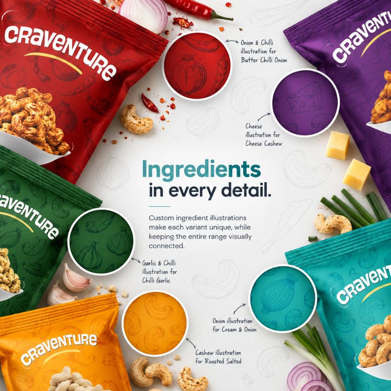
Custom illustrated patterns were developed around the ingredients and product cues associated with individual variants.
Chilli, garlic, onion, cheese, cashews and other ingredient references become part of the pouch background rather than being added as unrelated decorative graphics.
The illustration style remains consistent across the range, while the subject changes according to the product.
This allows every pouch to carry its own visual cues while remaining connected to the master packaging identity.
The Product
Remains the Hero.
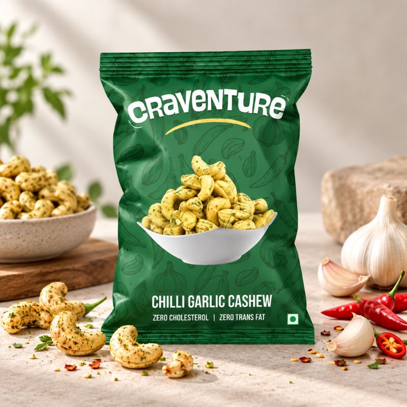
With strong colours and illustrated patterns creating the flavour environment, the actual cashews needed a clear focal position.
Product photography was therefore placed prominently at the centre of the packaging.
The bowl of cashews immediately communicates what is inside the pouch, while the surrounding visual elements communicate the flavour.
The composition creates a simple division of roles:
From “Cheese” to
“Butter & Chilly Onion”.
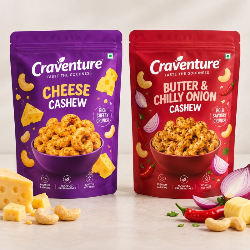
Not every flavour name occupies the same amount of space.
A short name such as Cheese Cashew and a longer name such as Butter & Chilly Onion Cashew both needed to work within the same packaging architecture.
The typography and product-name area were therefore designed as part of the master system rather than adjusted independently for every pouch.
This helped maintain a consistent hierarchy across the range while accommodating different product names and essential pack information.
The consumer sees the brand, product and flavour within a familiar structure across every variant.
A Cashew Pouch Design Built as an
FMCG Packaging System
Craventure was not approached as six isolated packaging artworks.
The cashew pouch packaging design was developed as a scalable master packaging system for an FMCG food range, combining consistent brand architecture with flavour-specific colours, ingredient illustrations, product photography and clear information hierarchy.
This approach allows additional flavoured cashew variants to be developed within the established visual language rather than requiring the packaging identity to be reinvented with every new SKU.
For a growing food or snack brand, that consistency can turn individual pouch designs into a recognisable product family.
Consistency Does Not Mean
Making Every Pack Look the Same.
The final Craventure range balances two requirements that can easily work against each other: individual flavour identity and overall brand consistency.
Colour separates the variants.
Ingredient patterns add flavour personality.
Product photography keeps cashews at the centre.
Typography creates hierarchy.
The master packaging structure connects everything back to Craventure.
Each pouch can stand independently.
Together, they become stronger as a brand family.
What stays consistent builds the brand.
A Packaging Language
That Can Grow
with the Range.
A master packaging system becomes more useful as the number of products increases.
When a new Craventure cashew flavour is introduced, the established design provides a foundation for extending the range.
The flavour can introduce a new colour, ingredient pattern and product cues while retaining the visual elements already associated with Craventure.
Instead of starting again, the brand extends.
It gives every new product a recognisable family to belong to.
The Complete Craventure Packaging Range
Six Products. Six Visual Personalities. One Consistent Packaging Language.
Six Products. Six Visual Personalities. One Consistent Packaging Language.
Strategic brand and communication direction for the project was led by Manish Vaishnav , with a focus on maintaining brand consistency while creating clear differentiation across individual flavour variants.
Design the System, Not Just the First Pouch.
Whether you are launching cashews, dry fruits, snacks or another FMCG food product, packaging becomes more complex as flavours, variants and SKUs increase.
A well-planned master packaging design can create consistency across the range while allowing every product to develop its own identity.
Looking for cashew packaging design, pouch packaging design or a master packaging system for your FMCG range?
Talk to Abhishek Branding LLP about your packaging project.
Discuss Your Packaging Project 